
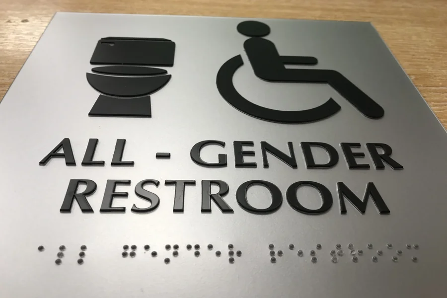
If you manage a public building or run a signage company, accessible signs aren’t optional. Get the Braille spacing wrong or skip tactile lettering on an accessible toilet, and you’ve got a sign that fails an audit and leaves visually impaired users stuck. We’ll walk you through what the rules actually say and how compliant signs get made, so let’s take a closer look at what separates a sign that passes from one that gets sent back.
What the Law Asks of UK Public Buildings
Two things sit behind every accessible sign in this country. The first is the Equality Act 2010, which requires organisations to make reasonable adjustments so disabled people aren’t put at a disadvantage. The second is the Building Regulations, specifically Approved Document M, which covers access to and use of buildings and points designers towards proper signage.
Approved Document M sets the legal minimum. It says key location information, like orientation and room signs, should be provided in both visual and tactile forms when they’re low enough to touch. For the detail on how to actually design those signs, it sends you to BS 8300-2:2018, the British Standard for accessible and inclusive buildings.
The simplest way to think about it is this. Part M keeps you on the right side of the law, while BS 8300 is the best-practice document that auditors, access consultants and architects reference day to day. When a tender asks for evidence of inclusive design, it’s almost always BS 8300 they mean.
Where Tactile and Braille Signs Are Required
You don’t need Braille on every sign in the building. Raised tactile characters are more widely required than Braille itself, but both are expected in specific spots. Accessible toilets, lift controls, refuge points, stair identification and main wayfinding junctions are the usual places where they become mandatory.
A few rules govern how these signs go on the wall. Tactile and Braille signs are mounted at roughly 1500mm from the floor, give or take 100mm, so they work for both standing and seated users. They go on the latch side of the door, around 100mm from the frame, so a user can find them in a predictable place every time.
This is where production quality starts to matter. The base panel, the raised lettering and the Braille all need clean, smooth edges, since anything sharp is uncomfortable to read by touch. Most fabricators producing these panels rely on CNC laser cutting to cut the acrylic base and the individual letters, with engraving handled in the same setup so text and symbols come out crisp and consistent. Working from a vector file means the same sign can be reproduced exactly across a whole building.
Getting the Braille Specification Right
UK Braille follows BS EN ISO 17049, which sets out the dimensions for dot height, dot diameter and the spacing between dots and cells. This is the part people most often get wrong, because Braille that’s too flat, too crowded or unevenly spaced simply can’t be read by touch.
A few points come up again and again in real specifications:
- Use Grade 2 (contracted) Braille unless the message is very short
- Position the Braille directly beneath the raised tactile text
- Raise tactile characters between 0.8mm and 1.5mm above the background so they read cleanly under a fingertip
- Leave a 6mm exclusion zone around the Braille cells so nothing interferes with the reading finger
- Keep all edges smooth and avoid sharp laminates
Visual contrast matters alongside the touch elements, since plenty of users have partial sight rather than none. BS 8300 recommends a difference of at least 70 points in Light Reflectance Value between the text and the signboard, and at least 30 points between the board and the wall behind it. Test it under both daylight and LED lighting, because contrast that looks fine on screen can wash out under a corridor strip light.
Materials That Hold Up
Acrylic is the workhorse material for tactile signage. Laser-engraved acrylic gives crisp tactile edges, wipes clean and keeps costs sensible, which is why you’ll find it on most door and toilet signs. For high-traffic environments where the signs take a hammering, photopolymer is tougher and holds its tactility well.
Etched metal with an infill is the premium option and lasts a long time, though you’ll want a matte finish to kill the glare. Whatever the material, the finish decides whether the sign reads properly under a fingertip, so it’s worth getting samples and checking them by hand before committing to a full run.
One practical tip for signage companies: keep your specification repeatable. Once you’ve nailed compliant colours, correct dot spacing, legible type and the right mounting height, you can apply the same recipe across an entire building and produce a clean audit trail at handover.
Getting It Right Before Handover
Accessible signage tends to be the last thing sorted on a project, which is exactly why it causes problems. Fixing non-compliant signs after the building’s open is expensive and awkward, while specifying them properly from the start costs very little extra.
If you take one thing away, make it the detail. The legislation gives you the why, BS 8300 and BS EN ISO 17049 give you the numbers, and good fabrication turns those numbers into a sign that someone can read with their fingers in the dark. Get all three lined up, and compliance takes care of itself.